PowerLearn
ThePower used Typeform to build its classes. They decided to build something of their own. What began as an internal need ended up becoming a B2B product that's now sold to companies.
My role
End-to-end design: research, definition of flows and logic, design of the editor and the student experience, coordination with business and development.
The problem
Typeform wasn't designed to build training
ThePower had spent years using Typeform for its classes. It worked, but it created friction: managers worked outside the platform's ecosystem, the student experience was inconsistent, and there was no control over the product. Building something of their own made sense. But the scope changed fast: if the tool was good, it could be sold to client companies that needed to create internal training for their teams. It was no longer just an internal problem.
The insight that changed everything: knowing from the start that there were two user profiles forced a different way of thinking. ThePower's creators knew the platform well; the training managers at client companies did not.
Key decision 1
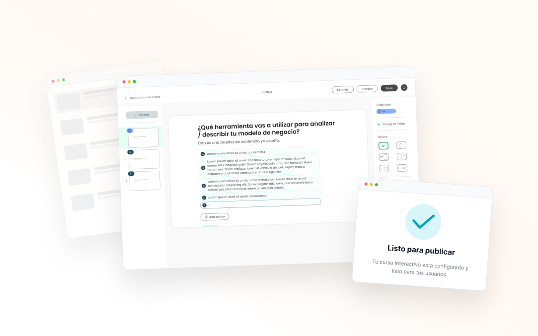
A presentation format, not a form
The first question was which structure to use as a reference. We looked at Typeform, traditional e-learning tools and presentation tools. The research insight: creators structure content better as slides, not as “questions” or “lessons”. That mental model was already there. Betting on that format meant an almost-zero learning curve and the flexibility to mix content types.
Key decision 2
One editor for two completely different logics
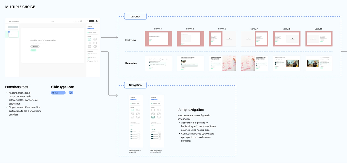
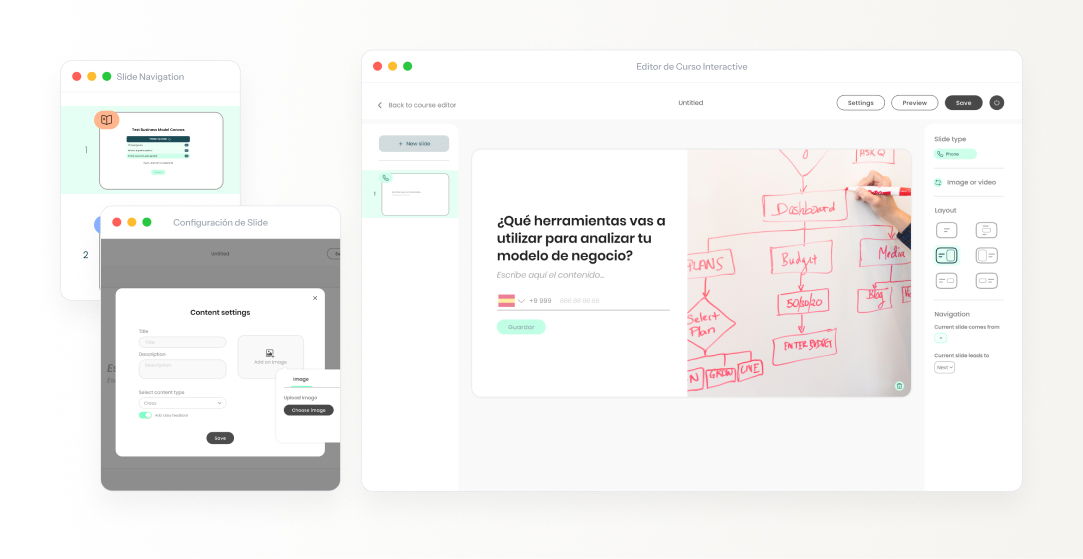
The product had to cover both lessons and assessments. They're cases with radically different navigation: in a lesson the student moves linearly; in an exam there's branching based on the answer and conditional blocks. The decision was a single editor for both modes instead of two separate tools — nobody wants to learn two different interfaces for related content. This demanded the most intense definition work: mapping every navigation case and documenting it precisely enough for development.
Jump navigation was the most complex part technically. It required specifying the interaction for many cases so development could implement it faithfully.
Key decision 3
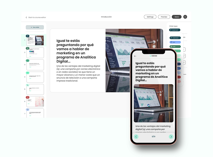
Designing both sides: editor and student experience
An easy mistake would have been to focus only on the editor. But the student's experience consuming the content was just as critical — it was what the B2B clients would see and sell internally to their teams. Designing both sides from the start kept the product coherent: editor decisions had direct consequences for how content is displayed, and understanding them together avoided implementation problems.
Creator view vs student view — two different experiences, one same content.
| Editor · creator | Experience · student | Why it mattered |
|---|---|---|
| A canvas full of editable thumbnails and a slide-type panel. | A clean render on the platform, slide by slide. | The creator iterates; the student consumes. Each side needs a different interface. |
| Jump navigation configurable per answer option. | Navigation that follows the flow, without ever seeing the logic. | Complexity lives in the editor, not in the student experience. |
| Navigation and conditional-logic setup. | Reinforcement or advance depending on the result. | The student's content stays coherent with the player's logic. |
Results
From internal tool to business line
Shipped in record time, from scratch.
Client companies use the tool actively.
ThePower no longer depends on Typeform.
Commercialized as PowerLearn — a standalone B2B offering.
Reflection
What I'd do differently
I'd have involved training managers from client companies sooner, not just the internal team. We worked mainly with ThePower, who knew the previous tool well. When the product reached the external B2B user, needs appeared that we hadn't anticipated. A couple of early testing sessions with that profile would have saved iterations already in development.